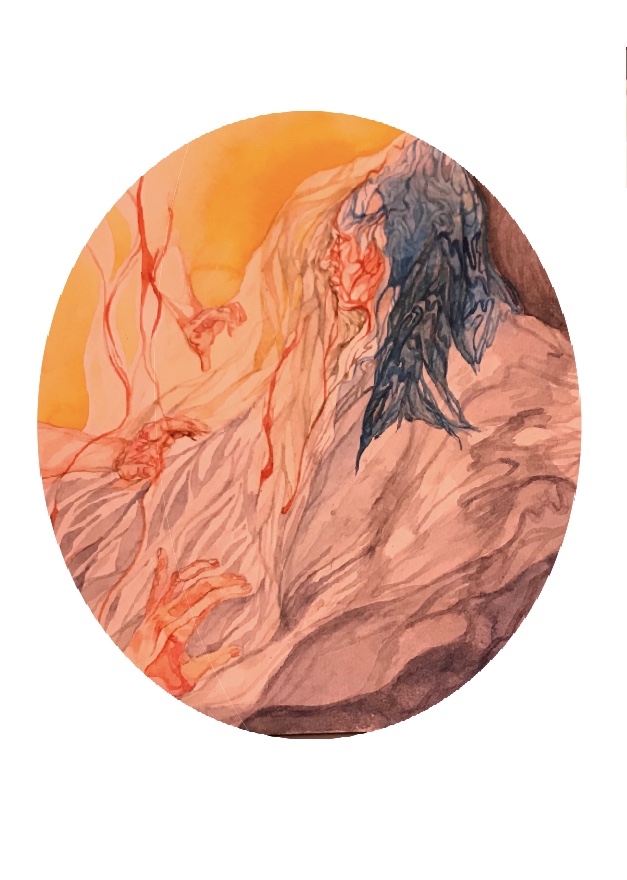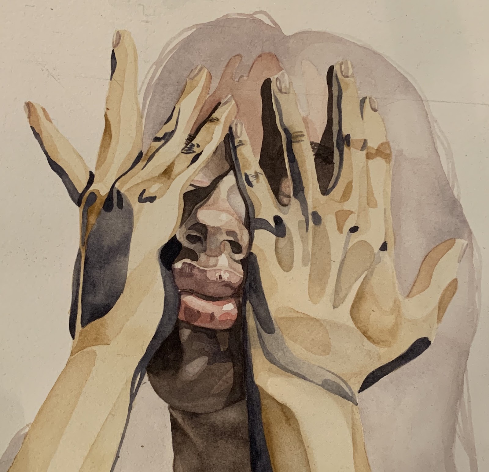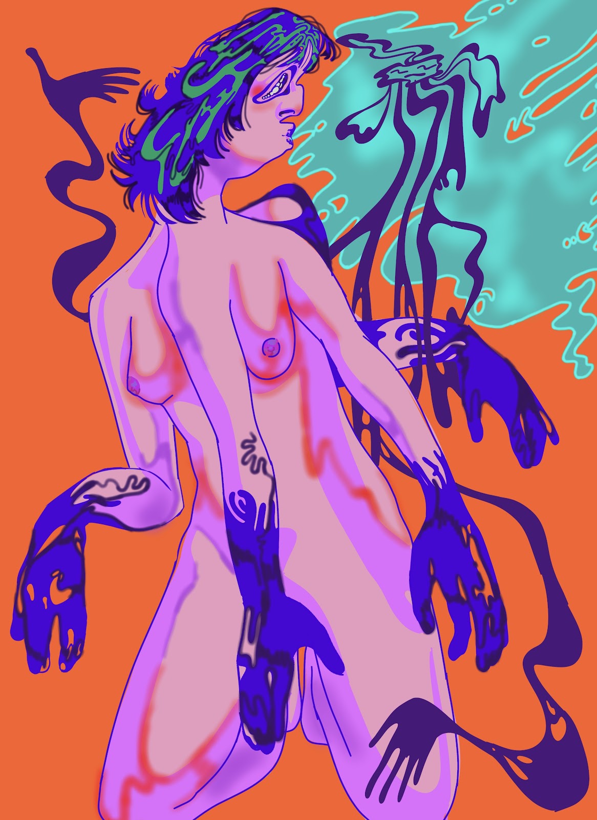
The multiple arms imply movement, but it is unclear whether the body is meant to be turning to the left or right, front or back, only that it is in some restless motion. However, the legs are kneeling, grounded. The head is twisted, looking back, seeming to be able only to stare at the figure that embraces it. This creates a tension between the parts of the body, implied motion and implied stasis both existing at once. The patterns on the arms, hair, and the lines that make up the figure unite the composition, suggesting that though they are discrete, the touch and connection between the person and the spirit that embraces it make each tangible.
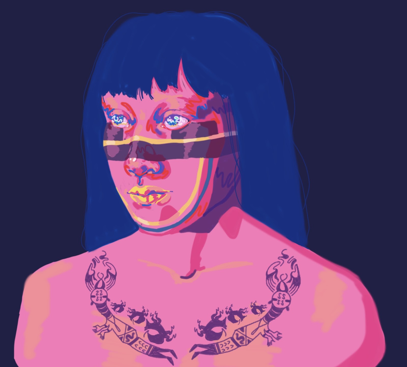
The colors of this piece are based off of the secondary colors purple, orange, and green, while the blue that creates the lines and patterns on the figure’s body are blue, a color that breaks the color scheme and enhances the brightness of the tangerine background and raw purple-pink skin. Everything is enhanced; color, sensation, and movement overtakes the image.